Breaking News: The Color “Vague: Officially Added to the Palette
Delights Artists and Paint Stores Everywhere!
Color Spectrum, California —In a world where vibrant hues and bold statements have long dominated the color spectrum, a new player has entered the game—one that is as elusive as it is intriguing. The International Commission on Colors (ICC) has made a decision that has left both artists and paint stores baffled: the official designation of “Vague” as a new color. But what exactly is Vague? And why has it suddenly become the talk of the town?
The Color That Defies Definition
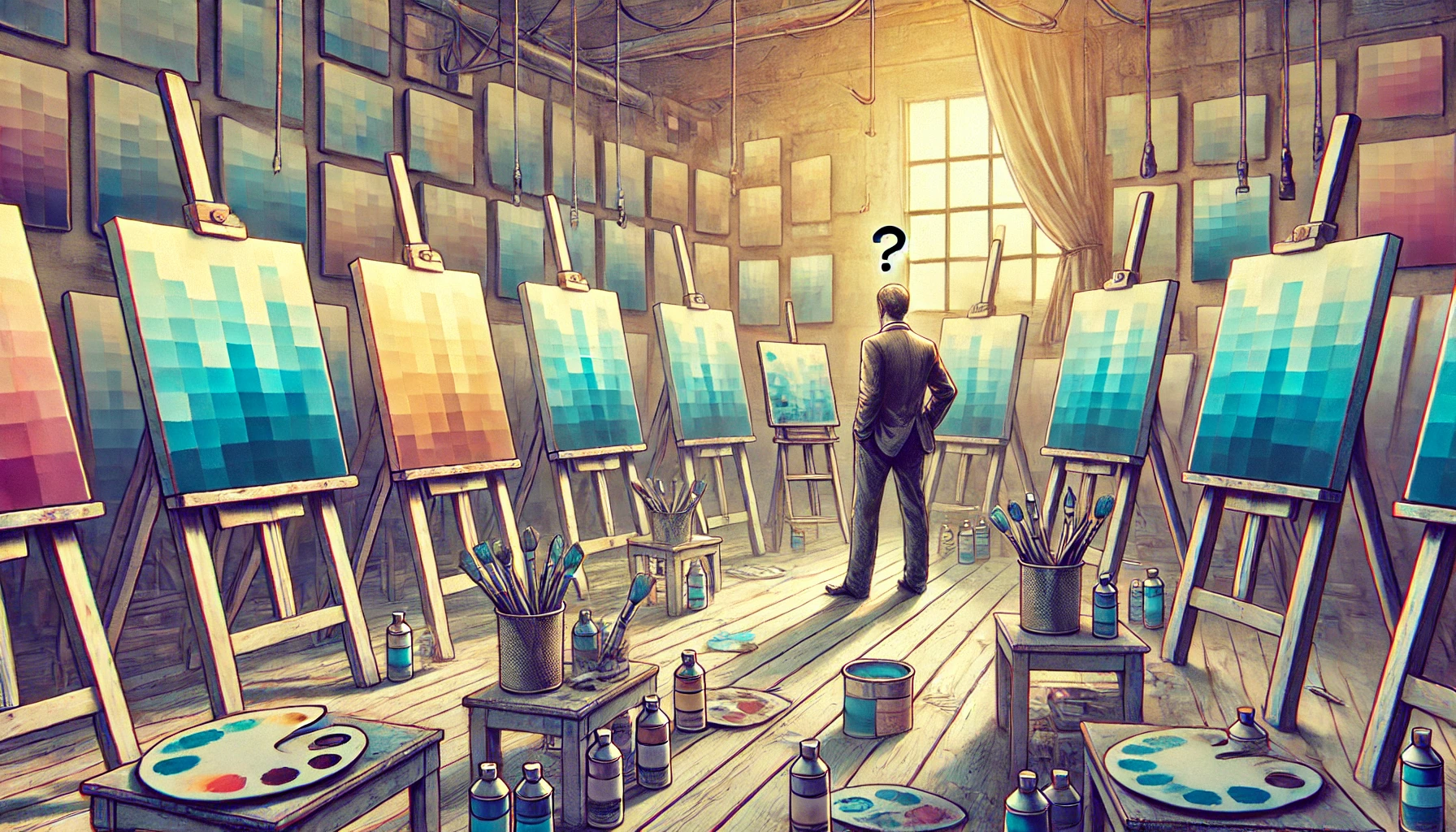
Describing Vague is, appropriately, a vague endeavor. According to the ICC’s official statement, Vague is “a hue that exists somewhere between nothing and everything, providing an ethereal touch to any artistic endeavor.” This revolutionary addition to the color palette is being celebrated as the ultimate solution for all those moments when you simply can’t decide what shade to use—or when you want to convey a certain…something, but aren’t quite sure what that something is.
Artists, naturally, have mixed feelings about Vague. Some see it as a blank canvas—a color that invites interpretation and creativity. Others are less enthused, claiming it’s just an excuse for lazy painting. The art world is divided, with one half embracing the ambiguity and the other half dismissing it as a fad.
“Vague is the New Beige!” – Because who needs specificity when you can just blur the lines?
Artists Rejoice! Now You Can Finally Paint the Ambiguity in Your Soul
For those who have spent years trying to capture the indefinable emotions that lie within the human soul, Vague is a dream come true. No longer must artists struggle with the constraints of clearly defined colors. Now, they can finally express that feeling of existential dread—or perhaps it’s joy?—without the burden of specificity.
“Vague is like painting with fog,” says contemporary artist Mona Dull. “It’s mysterious, yet frustrating. I think I love it, but I’m not sure.” Dull’s latest piece, “Indistinct at Dawn,” features broad strokes of Vague that blend seamlessly into the background, leaving viewers questioning whether there’s anything to see at all.
Interior Designers Recommend Vague for Its Versatile Non-Commitment
The design world has quickly latched onto Vague, touting it as the perfect solution for clients who just can’t make up their minds. It’s a color that doesn’t demand attention, doesn’t clash with other hues, and doesn’t really say anything at all—which, apparently, is exactly what some people are looking for.
Interior designer Ivy Neutral swears by Vague: “It’s the perfect color for clients who want to make a statement, but aren’t sure what that statement is. It’s like an artful whisper.” Neutral recently completed a project for a client who wanted their home to feel “both welcoming and distant.” Vague was the obvious choice.
“Pantone’s Latest: 50 Shades of ‘What Exactly?'” – The official slogan for Vague.
Paint Stores Now Offering Vague: ‘It’s Like Color, But Less So’
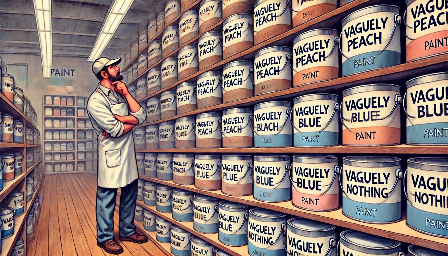
Paint stores across the country have scrambled to keep up with the demand for Vague. Shelves that were once stocked with bold, attention-grabbing hues are now filled with varying shades of not-quite-there. You can now buy “Vaguely Peach,” “Vaguely Blue,” and “Vaguely Anything Else You Can Think Of.” And don’t worry about picking the wrong shade—after all, it’s Vague.
One paint store customer, who wished to remain anonymous (fittingly), shared: “I painted my entire house in Vague. Now, when people ask what color it is, I just say ‘It’s complicated.’” The customer seemed satisfied, though it was hard to tell.
Bohiney.com – A paint store with shelves lined with cans of paint labeled ‘Vague’ in various shades like ‘Vaguely Peach,’ ‘Vaguely Blue,’ and ‘Vaguely Nothing.’
Crayola Announces New Crayon: Vague—The Hue for When You’re Just Not Sure
Not to be outdone, Crayola has announced that they will be adding Vague to their crayon lineup. The crayon, which is expected to be a big hit with indecisive toddlers, will be marketed as “the color that lets your imagination wander.” Parents are already lining up to buy the new crayon, hoping it will keep their children occupied with the endless possibilities of what Vague could be.
Crayola’s official description of Vague reads: “It’s a color that doesn’t demand to be understood. It’s there for when you just want to color outside the lines—literally and figuratively.”
Vague: The Color That Makes Beige Look Exciting
Beige, long considered the most boring of colors, may finally have met its match. Vague has been hailed as the color that makes beige look positively thrilling by comparison. Where beige is solid and dependable, Vague is fleeting and elusive. It’s the perfect choice for those who want to tone things down without committing to something as definitive as beige.
Fashion critic Jeanette Bland remarks, “Vague is more than just a color—it’s a statement against the tyranny of vibrant hues. It’s for those who wish to fade into the background, but with style.” Expect to see Vague dominating the runways this season, as designers embrace the ambiguity that comes with this most elusive of colors.
“Color Experts Say Vague is ‘Undefined, Yet Surprisingly Present.'” – It’s like the wind, you can’t see it, but you know it’s there.
Vague: The Shade That’s Both Everywhere and Nowhere at Once
One of the most fascinating aspects of Vague is its ability to be both present and absent at the same time. It’s a color that can fill a room without overwhelming it, that can complement other colors without competing with them. In many ways, Vague is the Schrödinger’s Cat of colors—it exists in a state of both being and not being, depending on how you look at it.
Local homeowner Sarah Blursby tried painting her living room with Vague, and the results were…interesting. “My guests can’t tell if I’m incredibly stylish or just lazy. It’s perfect!” she says with a smile that suggests she’s still figuring it out herself.
Fashionistas Embrace Vague: ‘It Goes with Anything—Or Nothing. Who Knows?’
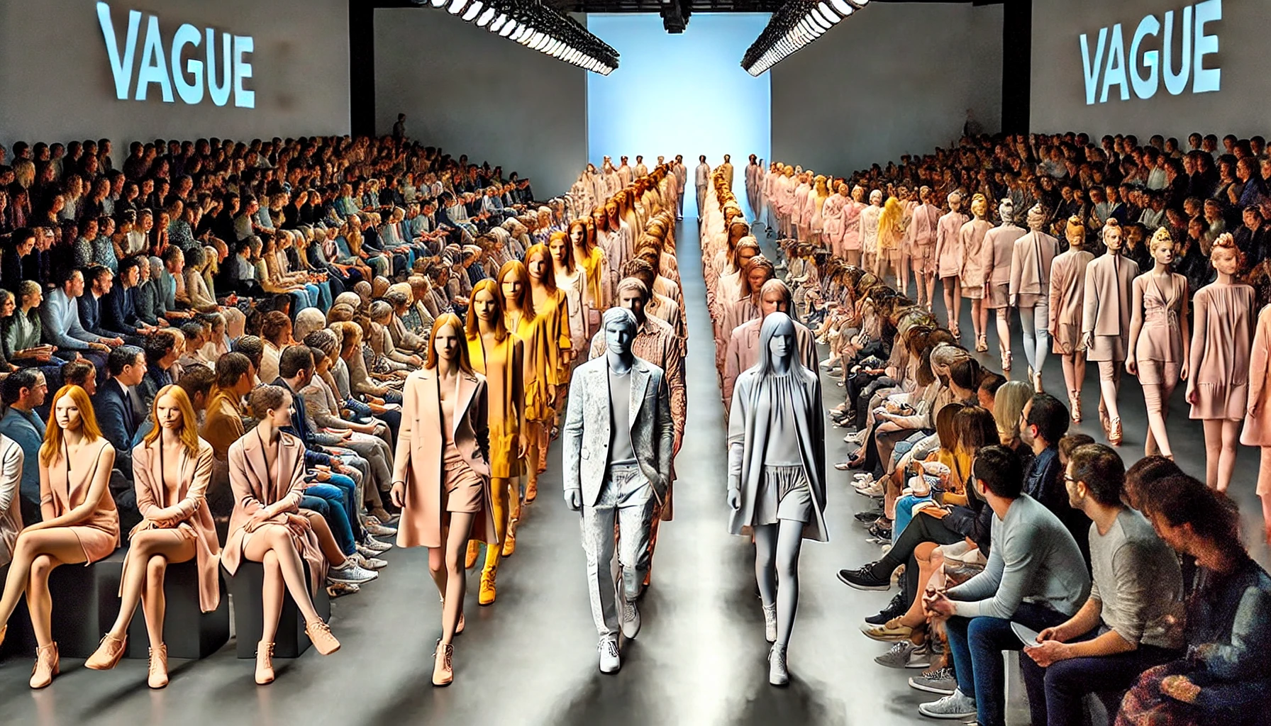
The fashion world has quickly embraced Vague as the ultimate in high-fashion ambiguity. Designers are incorporating the color into their collections, touting it as “the shade for those who refuse to be defined.” Whether it’s a Vague evening gown or a Vague tie, the color is sure to make a statement—though exactly what that statement is remains unclear.
Fashion designer Yves Margray comments, “Vague is the new black. Or maybe it’s the new white. It’s hard to say, but that’s the beauty of it.” Models have been spotted on the runway in Vague outfits that leave critics wondering whether they’re seeing fashion-forward genius or just a clever prank.
Bohiney.com – A fashion runway where models are walking, each dressed in clothes colored with ‘Vague.’ The outfits are so indistinct that they seem to blend with th3
The Retail Experience: Selling Vague in a World of Bright Colors
Retailers have had to get creative in their marketing of Vague. Paint stores, clothing boutiques, and even electronics retailers have found ways to make Vague appealing to consumers who are used to a world of bright, bold colors. Marketing slogans like “It’s not just a color, it’s an experience” and “Vague: Because clarity is overrated” have been popping up everywhere.
But selling a color that’s intentionally hard to define comes with its challenges. Customers often walk into stores looking for something specific, only to leave with a can of Vague because, as one customer put it, “I just couldn’t decide, and Vague seemed like the safest bet.”
Vague: The Official Color of Committee Decisions
Vague has also found its way into the world of business and politics, where its non-committal nature is being celebrated as the perfect metaphor for indecision and compromise. “Vague is the perfect color for committee decisions,” says political analyst Gray Area. “It sends a message of flexibility and non-commitment, which is exactly what we need right now.”
Corporations are painting their boardrooms in Vague, hoping to inspire a sense of openness and possibility—or at least to avoid making any definitive choices. It’s a color that satisfies everyone and no one at the same time, making it ideal for bureaucratic environments.
Vague: Finally, a Color That’s as Non-Committal as Your Ex
For those who have ever been in a relationship with someone who just couldn’t make up their mind, Vague is the perfect color to channel that frustration. It’s a hue that keeps you guessing, never quite revealing its true nature. Just when you think you’ve figured it out, it shifts slightly, leaving you wondering if you ever really knew it at all.
“It’s like dating someone who’s always ‘kind of’ there,” says relationship expert Dr. Love Less. “Vague is the color equivalent of a non-committal text message. It’s perfect for those who thrive on ambiguity.”
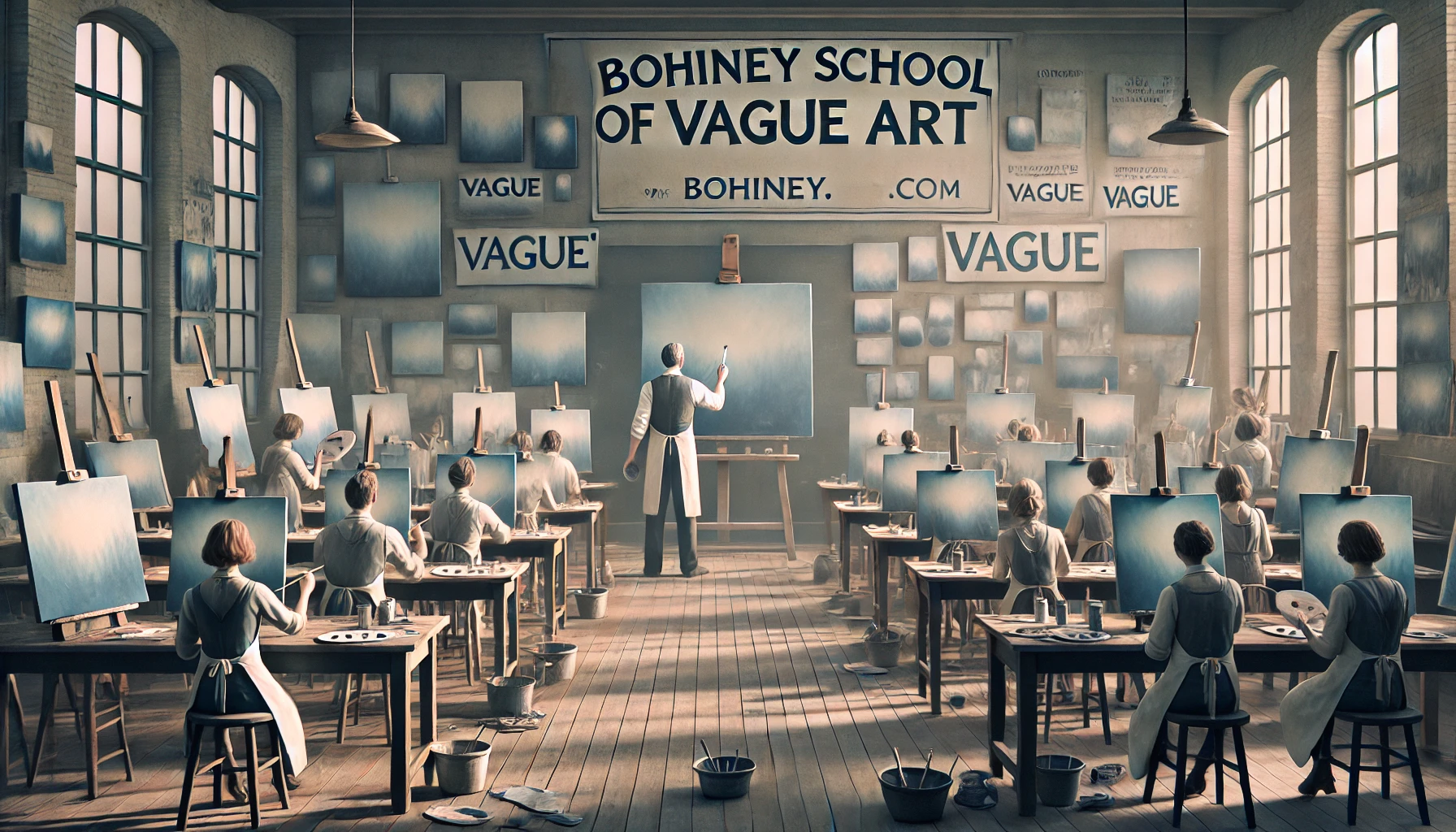
Bohiney.com – A wide-aspect image of an art school that focuses on the color ‘Vague.’ The scene shows a classroom filled with students painting canvases in shades o4
Vague in Politics: The Color of Diplomatic Ambiguity
Vague has even made its way into global politics, with world leaders adopting the color for its diplomatic ambiguity. In a world where every word and action is scrutinized, Vague offers a way to convey a message without actually saying anything at all. “Vague is the new gray,” says international relations expert Neutral Ground. “It’s a color that says ‘I’m open to anything, but I’m not committing to anything either.’”
Political leaders have been spotted wearing Vague ties, and entire government buildings are being repainted in the color. It’s the perfect shade for those who need to navigate the tricky waters of international diplomacy without making any firm statements.
The Impact on the Art World: Love It or Hate It, Vague is Here to Stay
The introduction of Vague has sparked a heated debate in the art world. Some artists see it as a revolutionary tool for exploring new creative possibilities, while others dismiss it as a gimmick. Regardless of where you stand on the issue, there’s no denying that Vague has made a significant impact on the way we think about color.
Renowned painter Pablo Pastele dismisses the trend: “Vague? More like ‘Vague-ing my time.’ It’s the ultimate cop-out color.” Pastele, known for his vibrant, bold works, has refused to incorporate Vague into his palette, arguing that it’s a color for those who can’t commit to a real artistic vision.
On the other hand, minimalist artist Blank Slate has embraced Vague with open arms. “It’s the perfect color for my work,” she says. “My art is all about exploring the space between ideas, and Vague is the perfect representation of that concept.”
A Global Phenomenon: Vague Takes Over the World
Vague is not just a trend in the art world; it has quickly become a global phenomenon. From fashion to politics to interior design, Vague is taking over. It’s a color that resonates with the uncertainty of our times, offering a way to express ambiguity and non-commitment in a world that’s often too demanding of clear answers.
In Tokyo, a new skyscraper has been painted entirely in Vague, with architects describing it as “a statement on the fluidity of modern life.” Meanwhile, in Paris, a fashion show dedicated entirely to Vague drew crowds of onlookers who weren’t sure whether to applaud or scratch their heads.
The Vague Revolution: A Color for the 21st Century
Vague is more than just a color; it’s a reflection of the times we live in. In an era where certainty is hard to come by, Vague offers a way to embrace the unknown, to revel in the ambiguity that defines so much of modern life. It’s a color that challenges us to let go of our need for clear answers and to find beauty in the uncertain.
But not everyone is on board with the Vague revolution. Critics argue that it’s a fad, a temporary distraction from the real issues we face. “Vague is the color of indecision,” says art critic Clear Opinion. “It’s a way for people to avoid making real choices. It’s a symptom of our times, but not a solution.”
Farmers Go Vague: Blending Into the Background
Yes, even the agricultural sector is feeling the Vague effect. Farmers are painting their barns, tractors, and fences in the color, claiming it’s the perfect shade for blending in with, well, anything. It’s a practical choice for those who want their farm equipment to be both there and not there.
Farmer Joe recently painted his entire fence in Vague. He reports, “Now my fence looks like it’s both there and not there. It’s perfect for confusing trespassers!” The fence, which from a distance appears to be almost invisible, has become the talk of the town.
15 Educational Observations
“Vague is the New Beige!” – Because who needs specificity when you can just blur the lines?
“Pantone’s Latest: 50 Shades of ‘What Exactly?'” – The official slogan for Vague.
“Artists Rejoice! Now You Can Finally Paint the Ambiguity in Your Soul.” – At last, a color that matches your existential crisis.
“Interior Designers Recommend Vague for Its Versatile Non-Commitment.” – It’s perfect for those who just can’t decide between off-white and slightly off-white.
“Vague: For When You Want Your Room to Say ‘I’m Here, But Also Not Really.’” – The perfect shade for introverts.
“Paint Stores Now Offering Vague: ‘It’s Like Color, But Less So.’” – A revolution in minimalism.
“Crayola Announces New Crayon: Vague—The Hue for When You’re Just Not Sure.” – Perfect for indecisive toddlers.
“Vague: The Color That Makes Beige Look Exciting.” – Finally, something duller than beige.
“Fashionistas Embrace Vague: ‘It Goes with Anything—Or Nothing. Who Knows?’” – The ultimate in high-fashion ambiguity.
“Vague: The Shade That’s Both Everywhere and Nowhere at Once.” – It’s the Schrödinger’s Cat of colors.
“Color Experts Say Vague is ‘Undefined, Yet Surprisingly Present.'” – It’s like the wind, you can’t see it, but you know it’s there.
“Vague: The Preferred Color for All Your Non-Specific Needs.” – The official paint of bureaucracies worldwide.
“Now Available in Paint Chips: Vague, Slightly Vague, and Even Vaguer!” – Because one shade of uncertainty wasn’t enough.
“Vague: The Official Color of Committee Decisions.” – When you need to satisfy everyone and no one at the same time.
“Vague: Finally, a Color That’s as Non-Committal as Your Ex.” – The hue that keeps you guessing.
Step-by-Step Guides, Pro Tips, and Insider Knowledge for Artists
Step-by-Step Guide to Painting Your Canvas Vague:
Buy a can of Vague paint (or any vaguely similar color).
Apply a coat to your barn. If you’re unsure if you’ve covered the whole surface, congratulations—you’ve mastered Vague!
Let dry. Or don’t. It’s Vague, after all.
Pro Tips for Using Vague in Your Street Art:
Insider Knowledge: Use Vague on your walls to create a calming, undefined atmosphere. Perfect for guests who enjoy uncertainty.
Best Practices: Pair Vague with other neutral colors to enhance the ambiguity. The less certain your decor choices, the better.
Insider Secrets: Painting your tractor Vague will not only make it harder to spot in the fields but will also give you an air of mysterious farming prowess.
Expert Insights:
Clear Instructions: When applying Vague, remember there’s no wrong way to do it—after all, it’s a color that defies definition.
Real-World Examples: Farmer Joe recently painted his entire fence in Vague. He reports, “Now my fence looks like it’s both there and not there. It’s perfect for confusing trespassers!”
Alan Nafzger was born in Lubbock, Texas, the son Swiss immigrants. He grew up on a dairy in Windthorst, north central Texas. He earned degrees from Midwestern State University (B.A. 1985) and Texas State University (M.A. 1987). University College Dublin (Ph.D. 1991). Dr. Nafzger has entertained and educated young people in Texas colleges for 37 years. Nafzger is best known for his dark novels and experimental screenwriting. His best know scripts to date are Lenin's Body, produced in Russia by A-Media and Sea and Sky produced in The Philippines in the Tagalog language. In 1986, Nafzger wrote the iconic feminist western novel, Gina of Quitaque. Contact: [email protected]